pyvista.Chart2D#
- class Chart2D(size=(1, 1), loc=(0, 0), x_label='x', y_label='y', grid=True)[source]#
2D chart class similar to a
matplotlibfigure.- Parameters:
- sizesequence[
float], default: (1, 1) Size of the chart in normalized coordinates. A size of
(0,
0)
is invisible, a size of(1, 1)occupies the whole renderer’s width and height.- locsequence[
float], default: (0, 0) Location of the chart (its bottom left corner) in normalized coordinates. A location of
(0, 0)corresponds to the renderer’s bottom left corner, a location of(1, 1)corresponds to the renderer’s top right corner.- x_label
str, default: “x” Label along the x-axis.
- y_label
str, default: “y” Label along the y-axis.
- gridbool, default:
True Show the background grid in the plot.
- sizesequence[
Examples
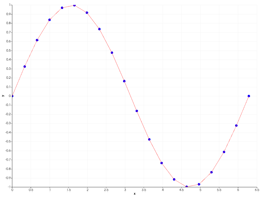
Plot a simple sine wave as a scatter and line plot.
>>> import pyvista as pv
>>> import numpy as np
>>> x = np.linspace(0, 2*np.pi, 20)
>>> y = np.sin(x)
>>> chart = pv.Chart2D()
>>> _ = chart.scatter(x, y)
>>> _ = chart.line(x, y, 'r')
>>> chart.show()

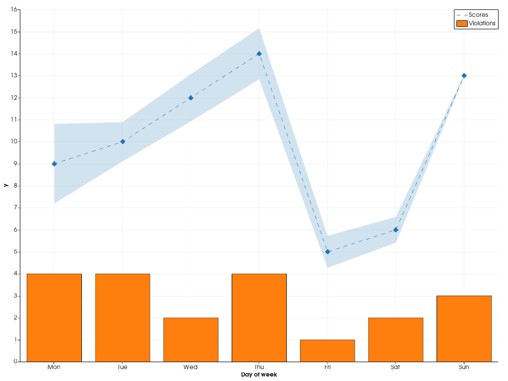
Combine multiple types of plots in the same chart.
>>> rng = np.random.default_rng(1)
>>> x = np.arange(1, 8)
>>> y = rng.integers(5, 15, 7)
>>> e = np.abs(rng.normal(scale=2, size=7))
>>> z = rng.integers(0, 5, 7)
>>> chart = pv.Chart2D()
>>> _ = chart.area(x, y-e, y+e, color=(0.12, 0.46, 0.71, 0.2))
>>> _ = chart.line(x, y, color="tab:blue", style="--", label="Scores")
>>> _ = chart.scatter(x, y, color="tab:blue", style="d")
>>> _ = chart.bar(x, z, color="tab:orange", label="Violations")
>>> chart.x_axis.tick_locations = x
>>> chart.x_axis.tick_labels = ["Mon", "Tue", "Wed", "Thu", "Fri",
...                             "Sat", "Sun"]
>>> chart.x_label = "Day of week"
>>> chart.show()

Methods
Chart2D.area(x, y1[, y2, color, label])Add an area plot to this chart.
Chart2D.bar(x, y[, color, orientation, label])Add a bar plot to this chart.
Chart2D.clear([plot_type])Remove all plots of the specified type from this chart.
Hide the x- and y-axis of this chart.
Chart2D.line(x, y[, color, width, style, label])Add a line plot to this chart.
Chart2D.plot(x[, y, fmt])Matplotlib like plot method.
Chart2D.plots([plot_type])Return all plots of the specified type in this chart.
Chart2D.remove_plot(plot)Remove the given plot from this chart.
Chart2D.scatter(x, y[, color, size, style, ...])Add a scatter plot to this chart.
Chart2D.show([interactive, off_screen, ...])Show this chart in a self contained plotter.
Chart2D.stack(x, ys[, colors, labels])Add a stack plot to this chart.
Toggle the chart's visibility.
Attributes
Return or set the chart's background color in interactive mode.
Return or set the chart's border color in interactive mode.
Return or set the chart's background color.
Return or set the chart's background texture.
Return or set the chart's border color.
Return or set the chart's border style.
Return or set the chart's border width.
Enable or disable the chart grid.
Return or set the visibility of the chart's legend.
Return or set the chart position in normalized coordinates.
Return or set the chart size in normalized coordinates.
Return or set the chart's title.
Return or set the chart's visibility.
Return this chart's horizontal (x)
Axis.Return or set the label of this chart's x axis.
Return or set the range of this chart's x axis.
Return this chart's vertical (y)
Axis.Return or set the label of this chart's y axis.
Return or set the range of this chart's y axis.